Overview
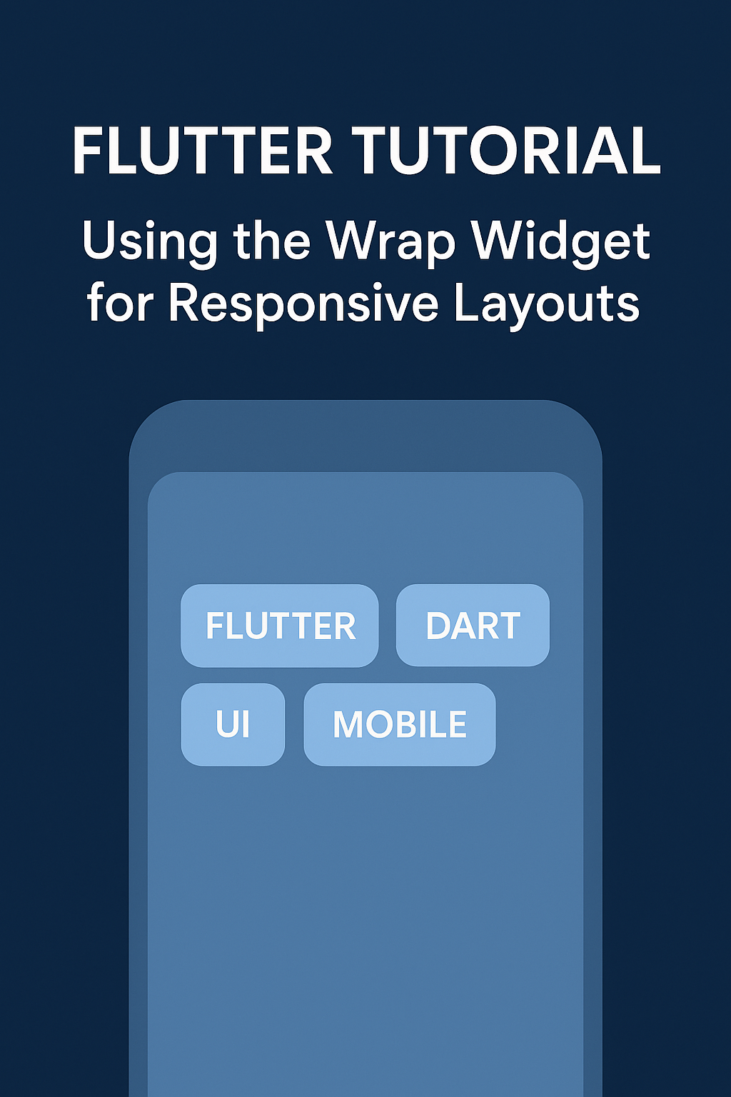
The Wrap widget in Flutter arranges its children in a horizontal or vertical sequence and automatically wraps them to the next line or column when space runs out. It’s ideal for creating responsive UIs like tag clouds, button groups, or image grids.
Basic Syntax
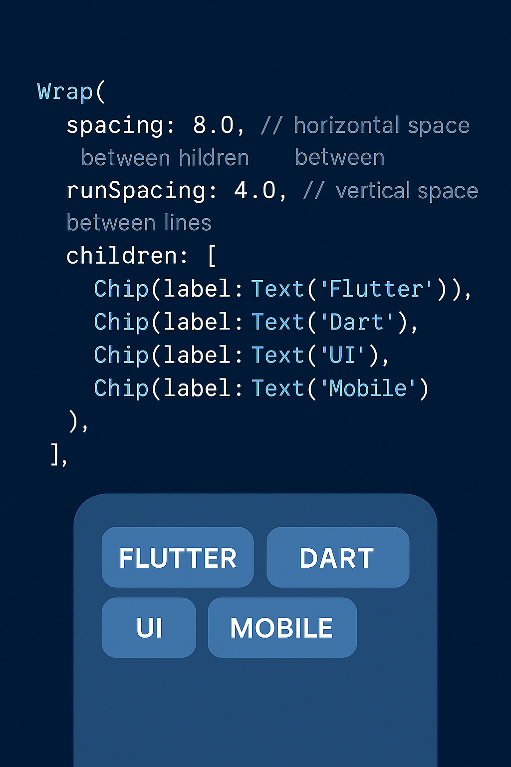
Wrap(
spacing: 8.0, // horizontal space between children
runSpacing: 4.0, // vertical space between lines
children: [
Chip(label: Text('Flutter')),
Chip(label: Text('Dart')),
Chip(label: Text('UI')),
Chip(label: Text('Mobile')),
],
)
Key Properties
| Property | Description |
|---|---|
direction |
Axis of layout: Axis.horizontal or Axis.vertical |
spacing |
Horizontal spacing between children |
runSpacing |
Vertical spacing between lines or columns |
alignment |
How children are aligned within a run |
runAlignment |
How runs are aligned within the Wrap widget |
crossAxisAlignment |
Alignment of children on the cross axis |
Use Case Example: Tag Cloud
Wrap(
spacing: 10,
runSpacing: 10,
children: List.generate(
tags.length,
(index) => Chip(
label: Text(tags[index]),
backgroundColor: Colors.blue.shade100,
),
),
)
This layout will automatically wrap the chips to the next line if they exceed the screen width, making it perfect for dynamic content.
When to Use Wrap vs Row or Column
- Use
RoworColumnwhen you have a fixed number of children and want strict alignment. - Use
Wrapwhen you have dynamic content or want automatic line breaks based on available space.